A lot of the time when I talk about visual design I talk about silhouettes. There are many things to consider when designing any visual element in one of the games I make, and thinking about objects in terms of their silhouette helps to remove distractions of things like colour, lighting and texture. We're then free to focus on a single element before we move on to those other things.
So how important and powerful is a silhouette, and what do I personally like and dislike when creating one? First, it's important to remember that visual design is just a series of decisions. Some of them are unconscious, informed by personal preference that makes certain things our first choice. Others are more actively reached, through trying a series of ideas to see which ones work best for us. Let's look at some of the decisions we can make when creating a simple element such as a sign.
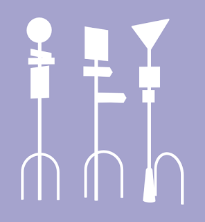
Every silhouette consists of two parts - the shape itself, seen here in white, and the negative space created by that shape, shown in Cold Purple. Seriously, that's the name. I used a
website to check to make sure people didn't try to tell me that it was Periwinkle or something.
Our silhouette here is very simple, very basic. Two roughly rectangular shapes. It gives us the information of "a sign", but it doesn't do much more than this. It's the most perfunctory silhouette we can probably give to such an object. To me this is not very interesting as a visual element. Maybe we might try to fix it by making it a bright colour, or more interestingly lit, or have some weird graffiti on it, or something of that nature. These are all viable solutions. But before we try any of those, it's a great idea to try and make the silhouette a bit more interesting.

Adding some complication to the sign by adding more elements is a great start. I like playing with ideas like this to see what effect it has. The first example here is not that interesting - it's not really what a sign looks like, but also the second, smaller horizontal element is placed in a spot that means the sign's pole has two shapes that are identical. I try to avoid an equidistant separation like this. Almost any other choice is better - we will get two pole lengths of different sizes if we put this new element anywhere else, and that means the shape is more complex and interesting.
The middle option is better, rather than having 2 shapes repeated, our pole is now a very short length and a very long one. This is a silhouette I'd favour over the first. The third one, though, breaks things up further by having a new width, complicating our shape even further. Just by arranging sizes and positions of the very simple elements in our silhouette we end up with a range of ways to make it more interesting.
We can further add interest by adding a variety of angles. Here we get into the negative space in a more interesting way. The first sign here is very similar to the third one in our last example, but now the negative space between the very top element and the wider one below it is different on either side of the pole. This wide element that's bisecting the pole may have alike silhouettes on either side, but the negative space it forms when paired with the angles above it are immediately more interesting to me.
The middle one adds a further complication by means of a different shape on one side of that, and the third example adds overlapping elements at different angles - now we're using 4 very basic elements to make quite a complicated silhouette with a sense of depth, and with a wonderfully complex effect on the negative space around it. This is the sort of silhouette I want my choices to result in, typically.
Armed with these ideas, we can turn the simple idea of designing the core shape of something as simple as a sign - before we get to colour, texture, lighting, decoration and such - into a range of possibilities, with a large variety of shapes available even with just very basic elements, simply by paying attention to the size, placement, design and overlap of these basic elements. A simple silhouette provides endless choices like these to the designer. Each element provides opportunities of juxtaposition, repetition, balance and imbalance.
But silhouettes don't just exist in solitude. You'll often hear artists refer to "grouped masses", which is just a nice way of saying, basically, "a number of things placed closely together in order to read as a group". Artists say things like that, as well as "equidistant" and "juxtaposition", and therefore are not to be trusted.
Linguistics aside, you can see here how when combined with other elements that are not necessarily a part of our object, but are arranged in a fashion so that they present a unified silhouette, we end up with an even larger range of design possibilities. This sort of silhouette is everything I typically desire from a visual element's silhouette. Before we even think about anything else, we have a beautiful range of visual elements in a single blob. The best part is that this interplay helps when it comes time to address the other elements of our scene - we can contrast the colour of the different elements against each other, we can use one element to cast shadows onto another part of the form, and so on. Unless an element is intended to be simplified for stark, punchy effect (also a viable approach to silhouette design!), I want something like this.
And when we're grouping masses, of course, the same considerations as before apply. The first sign here shows an equidistant bisection of our bicycle rail, resulting in two identical shapes. It adds to the silhouette overall, but compare it to the middle example, in which we only have to shift it a small amount in order to vary what this brings to either side of the silhouette widely. And our third example demonstrates that you can have it
just touching and still existing as a valuable contribution.
These are the sorts of things I am talking about when discussing the silhouette of a design or object or character. It's an incredibly simple thing in terms of skill - anybody can test these choices and ideas, as we've shown here with our arrangements of very simple forms, and the amount of power they present to us as designers is vast. Again, design is just a series of decisions, and every single element we add offers us a multitude of these decisions. Be bold, dynamic and thoughtful with your silhouettes!


No comments:
Post a Comment