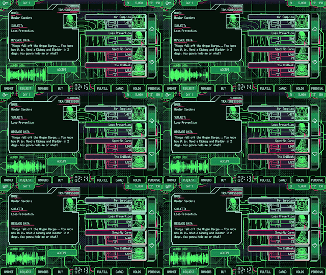
Space Warlord Organ Trading Simulator's aesthetic was a vulgar, throbbing mess. What a fun project. The palette ended up being a mix of P1 phosphor greens and a sickly alt-CGA dose of magenta, purple & infra-cyan, dithered to hell and brought to life in flashing, pulsing style.
That palette helped us make the game something unique. I always like to work on projects that are recognisable at a glance - being memorable is more interesting to me than just "looking good". It's fun to make a game that you can't possibly mistake for anything else.
We chanted "MEAT" at each other, shared our love for the Command & Conquer install program, and embraced the dither, the weird palette shifts and somehow wholeheartedly brought this to life. Try to convert a screenshot of the game to greyscale and you'll see how much of the palette's contrast was derived from unusual leaps in hue & saturation that somehow end up working. I love limited palettes for a multitude of reasons, but hadn't used them in over a decade. This might be one of the best ones I've worked in.
I think the fever of our work on the game shows in the finished product. Colours flash and glow, the flesh throbs, the market moves constantly and stressfully. It's uncomfortable, kind of repulsive, and it knows exactly what it is trying to be. It took me back to days of gleeful chaos in jam games, weird experiments, of being a young game developer and indulging in the act of creating something. It's very different to most of my work now, which is carefully planned, and quite rigid in its definition of success and beauty. Very satisfying work, but I also loved revisiting that chaotic energy of old here.


No comments:
Post a Comment