Wednesday, September 22, 2021

The power of a workflow


One of the most interesting areas of focus for me when drawing is on finding a powerful workflow for asset creation, that exists in the form of a deliberately delineated series of steps which I do to completion before moving onto the next stage. My idea is that each stage should address a specific problem, and solve it to full satisfaction, before progressing. That way I'm not thinking about colour when I'm trying to paint light, I'm not adding lightsources when trying to paint texture, etc. For an artist who is easily distracted this helps to maintain focus, and also stops me from being overwhelmed. The image above is an example of me trying to refine my workflow for background painting for Old Skies. While it's not quite indicative of the process that I use now, it was a vital step in finding that process, and you can see my basic notes that helped me to remember what I did when.

Today I was working on character design, and I realized that I have not delineated my workflow here sufficiently. I have it well defined for the stages of creating a final drawing - lines, colour, shadows, etc, and have very clear notes, palettes and brushes created for this section of the work. What I'm missing, though, is the construction phase.

The issue is that when constructing my characters, I'm still relying on a lot of guesswork. I should know how many heads my character's proportions are - if not from memory, from a set of notes that I can check. I should be able to break the process of drawing a character's line art down into a series of constructive steps that solve things like posture, proportion, volume and silhouette. I do not currently have this in place. That meant that today was a poorly directed series of re-drawings, never quite focusing on a single element at a time. To have a carefully designed dynamic silhouette that is badly proportioned is not very useful. The same applies to spending a lot of time detailing overlapping volumes over a stiff or awkward pose. Said pose should be completely solved before I even begin to think about those volumes - just as the proportions should be measured and decided before working on the silhouette.

Happily, well documented processes for constructing figures exist in bountiful quantities, are well described, and quite sensibly illustrated with examples. My issues lies simply in my inexperience drawing in this style, and my focus has been largely on trying to figure out what the style actually is. Now that I have a good understanding of that, I need to go back to the basics of how to reach it from a blank page. I should have kept this in focus from the beginning, but being foolish and lazy has served me reasonably well to date, and therefore it takes days full of poorly directed efforts like today in order to be motivated enough to alter my methods and do things right.

For me, though, this is one of the best things about being a working illustrator. Art isn't a magic skill. You don't have to be born with it to succeed. You just need to learn the steps, one by one, and practice them. How hard can it be, right?

Thursday, September 16, 2021

Tinkering


 As I look back on Old Skies in its current state, and try to work out my strengths and weaknesses at the moment, it occurs to me that my favourite aspect of game development is the act of tinkering about with a project. For me, tooling about in an engine or a piece of pixel art software was a bit like messing about with an electronics set - a chance to connect things together and see how they work, try to fix things that aren't working, and the chance to see something come to life. That's what drew me into game development in the first place.

When my focus shifted from writing functions and designing interactivity to making art, I found other ways to tinker - trying to find new ways of making cool graphics, learning different processes that added things to my toolbox of skills. It's always satisfying to me to do something that I didn't know how to do previously. Doing something I already knew how to do is satisfying, too, but in a different way.

I never really enjoyed making background art for games until I managed to find the fun in it, to break it down like that electronics kit into a series of steps that eventually results in something that works. I firmly believe that if you take someone and get them to do the thing that they truly care about, you can get great work out of anybody. For me, I think I need to find out how to tinker with the areas of my current work that are weaknesses, because that's what drives me. 

It's important to me to produce good amounts of work, of course, one only has to peek at my todo lists to understand that if I didn't, things would very quickly be very bad for me. But I think if I can find that happy medium between tinkering and productivity in all current areas that I'm working in, the end result will be a better game. Can I make "character animations" part of that electronics kit? I guess it's something to work on!

Wednesday, September 15, 2021

Progress!


I'm approaching the 'complete' stage on the first section of Old Skies, and it's interesting to see what has changed in the process. In June of this year I spend the entire month just trying to figure out what was necessary to get this game made. I animated some things with far too many frames, with far too few frames, put too much detail into things and also not enough detail into things, and at the end of it all, felt like I had a decent handle on what looked decent, and what did not. I also felt like I had created a better workflow, to be more productive and get my todo lists done without being overwhelmed.

Since then, I've been knee deep in pure production. I also got a new PC, a few new pieces of hardware to make the job easier, and have done a few more bits of experimenting with style to make sure our close-up shots are still cohesive with the rest of the game, but mostly it's just been crossing things off the todo lists. What's interesting about this phase of production is that I feel like my standards shift a bit - I get less ambitious, and realise that I have to cut some corners in order to get everything done on the game in a timely manner. This always happens, but I'd forgotten it, yet again.

Looking at what we have now, though, I think we're going to have a decent looking game. It feels like we're doing what we always did - just now a lot higher resolution. My biggest fear, pre-June, was that the backgrounds and characters just didn't work together, and didn't look that good, individually. Since then this fear has changed, and I have new fears, new things I want to tweak, edit, adjust, redo. I never have enough time to do this, of course, but making something is meant to be a learning process. Of course I'd do it all differently in hindsight.

Overall, though, the response to how Old Skies looks now has been great. My animation still needs some work, my todo lists still feel enormous and there's still a long way to go before I can say I know how to do a game in this exact style, but we're getting a lot closer. Thanks for your support, all! I'll share some more detailed art thoughts soon!

Wednesday, July 7, 2021

Shadows are cool

 In my preparation for moving to hand drawn characters I investigated a range of character shading options to see what would work. I knew from the beginning that I didn't particularly want to do tween based animation, which ruled out the quite detailed hand painted style of games like Memoria. I felt that my line art skills were not really solid enough to give characters convincing depth without any shading at all, so I ruled that option out fairly quickly, too. My attempts at using a soft brush to do subtle shading were quite promising, but in the end, I decided I wanted to try something a little more angular, a little more stylish, to match what I had in mind for the overall character design style. Thus I opted for the single colour shadow style that one sees quite a lot in animated shows and films.

With the encouragement of Ivan Ulyanov, who had done his own experiments in making A Poison Green, I also added a dark gradient to characters. This sort of acts as a bit of ambient occlusion, as well as keeps the lightest colours up at the faces - our most important part - and just really helps ground characters into the backgrounds and helps them feel like they fit. The end result is the look we've been showing around:

What I want to talk about specifically here, though, is the colour of these shadows. It's easy to think of shadows as merely "darker" and highlights as "lighter", but I don't think this really does the complexity of light much justice. It's useful as a simple description, but in reality digital colour shifts can be simplified into three different directions in the colour model I use: hue, saturation and value.

When we say "darker" or "lighter", we are talking about value. When we do a painting in black and white we call this a value painting, or a value study. We can already assume that the value is going to get darker, because we have a fundamental understanding of light and shadow, so we don't need to cover that here.

Saturation shifts can also be incredibly useful, however it's outside of the scope of what I'm trying to do with this project in the characters. It's something I absolutely love fiddling with, and I will probably talk about at some point, but not today.

What I really want to focus on, then, is a shift in hue. Hue shifts are a wonderful tool because they allow us to play with ideas of colour temperature. Most of the light sources we're familiar with in our daily lives and the media we see are warm colours. The glow of the sun, standard room lighting, candles, fireplaces, that sort of thing. Cool lighting, such as some fluorescent lighting, electronic screens, the glow of the moon, etc, feel less natural - sometimes even artificial, or mystical. We can play on these to great effect. But when we're setting up a standard lighting scheme, that's intended to fit across a wide range of environments, it makes sense to keep our light colours warm, and our shadow colours cool.

This has additional effects, other than being suggestive of (and making our character fit in with) warm lighting. It also helps to hint at secondary light sources - whether fill lights, diffuse lighting from a blue sky filling in some of the shadows (another topic for another time), and it also helps bring added contrast to the shadows meaning we can make our shadows stronger without having to make them darker. You can see in the example above that I have lit the scene with a warm main light, and then filled the shadows with cool teal diffuse light and rim lights. This makes the colour scheme feel less flat than a straight value shift of dark to light, helps our character fit in, and also gives our scene a bit of a designed feel - something I value!

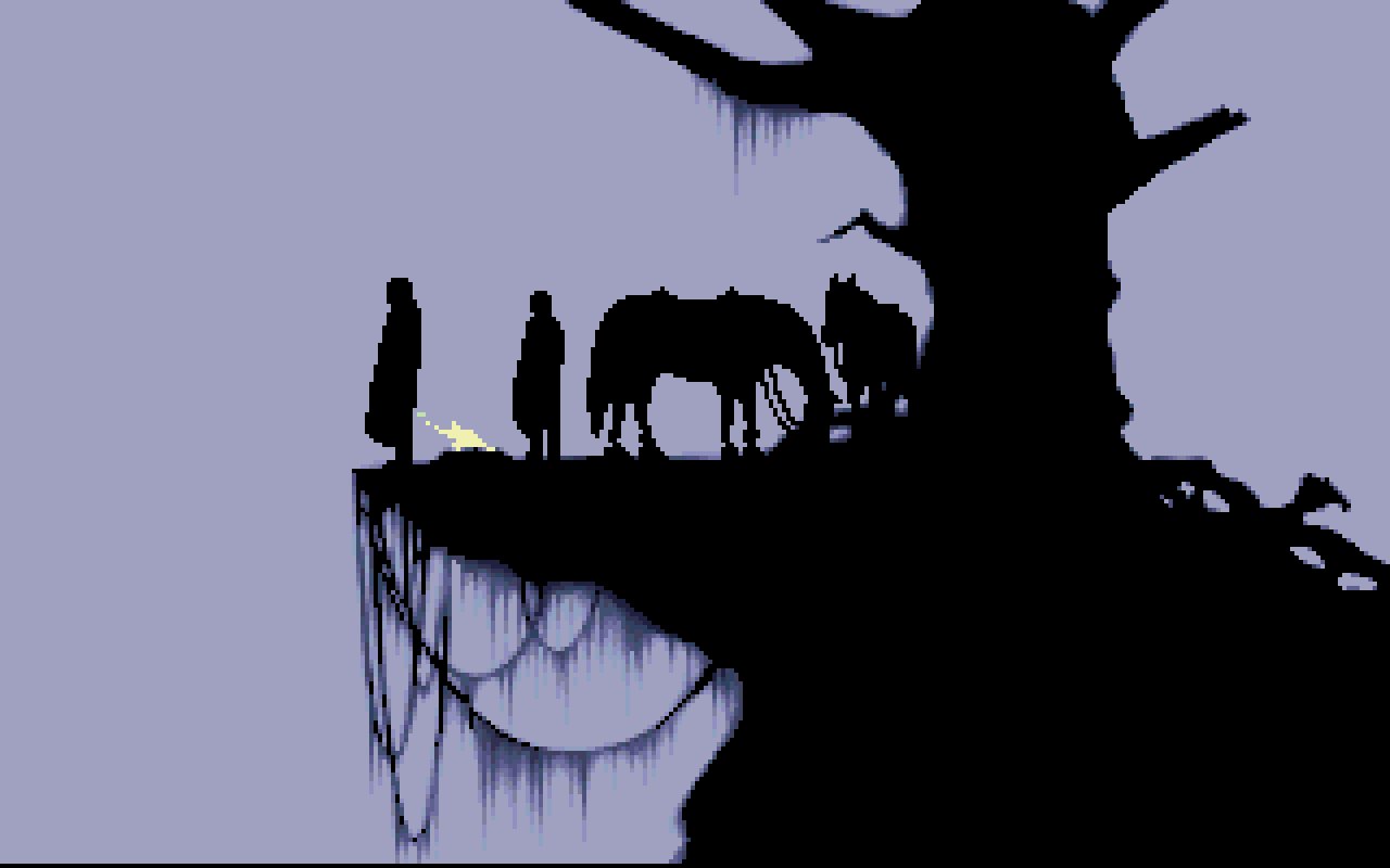
So let's see some examples of this kind of hue shifting in action, and then see how our Fia compares to the experts! The wonderful thing about computers is we can use our handy eyedropper tool to pick these images apart and see what our eye might not gather from observation.


The original Ghost in the Shell film has a wide range of hue shifts, and a wonderfully broad range of lighting setups. This has always been one of my favourite parts, though, and you can see the clear hue shift to a more green skin tone in the shadows. This is the sort of look I wanted when Dave mentioned he was looking to do a science fiction game, and while I know he's not going to lean into the genre anywhere near as hard as GitS, was one of my first points of reference when gathering inspiration.


The super low saturation in the skin tones here allow for a really, really big hue shift in this shot from The Chronicles of Riddick: Dark Fury. This sort of shift is not very usable with what I would call a standard skin tone, but in the cold lighting this works super well. Again, very low saturation means this massive leap in hue is less noticeable, simply because there's less hue in both the highlight and shadow areas to be affected by such contrast. Not as useful for our reference, but an interesting example of how big a jump can be possible and still look correct.


The hue shifts in this wonderful piece by Xi Zhang are a little harder to colour pick - there's a lot of noise here, and subtle gradients, and we're actually looking at two different shadow regions, rather than one, but a quick look at the clouds affords us a glimpse at a more simple light/shadow pairing, and you can see once again a nice hue shift from warm yellow to a cooler green. A more complicated lighting setup overall, and a bit less of a reliable source, but still interesting to study nevertheless.


In contrast with the very low saturation skin in the earlier shot of Riddick, the high saturation skin in this excellent illustration by Pius Bak shows a very small shift in hue, which still works to excellent effect. What's particularly fun for me is that the low saturation areas of face paint show a much higher jump in hue. Mostly this suggests to me that a teal colour on a multiply layer is how the shadows were applied here (which is how I'm doing it in Old Skies, too), but it's still very interesting to observe this effect. It's worth looking at this series of images by the same artist to see a nice range of hue shifts, both warm and cool, being used between light and shadow colours, and seeing the interesting effects that these different shifts have on each design.


Finally, we're back to our Fia, to see how her hue shifts compare! The left hand side lines show the shift between the bottom of her uniform, where the ambient occlusion gradient is having its strongest effect, and the right hand side lines show the top of her uniform, where the shift is quite weak, and about comparable to the shift in hue in her skin tones. As you can see, this is quite a mild shift - after all, we have to fit her into a wide range of environments, with different lighting setups, and we'll be tinting her sprite in game. But it's still a hue shift that's reasonably comparable to what artists in film and illustration use. 

There's a bit of insight into my thought process in designing the character style for Old Skies, and some of the thinking behind particular choices I made. I think it's valuable to take control of both hue and saturation when adjusting your value, and seeing how it can bring different stylistic approaches to your work. Shadows are cool! 

(Sometimes)

Monday, July 5, 2021

Design in silhouettes


A lot of the time when I talk about visual design I talk about silhouettes. There are many things to consider when designing any visual element in one of the games I make, and thinking about objects in terms of their silhouette helps to remove distractions of things like colour, lighting and texture. We're then free to focus on a single element before we move on to those other things.

So how important and powerful is a silhouette, and what do I personally like and dislike when creating one? First, it's important to remember that visual design is just a series of decisions. Some of them are unconscious, informed by personal preference that makes certain things our first choice. Others are more actively reached, through trying a series of ideas to see which ones work best for us. Let's look at some of the decisions we can make when creating a simple element such as a sign.


Every silhouette consists of two parts - the shape itself, seen here in white, and the negative space created by that shape, shown in Cold Purple. Seriously, that's the name. I used a website to check to make sure people didn't try to tell me that it was Periwinkle or something.

Our silhouette here is very simple, very basic. Two roughly rectangular shapes. It gives us the information of "a sign", but it doesn't do much more than this. It's the most perfunctory silhouette we can probably give to such an object. To me this is not very interesting as a visual element. Maybe we might try to fix it by making it a bright colour, or more interestingly lit, or have some weird graffiti on it, or something of that nature. These are all viable solutions. But before we try any of those, it's a great idea to try and make the silhouette a bit more interesting.


Adding some complication to the sign by adding more elements is a great start. I like playing with ideas like this to see what effect it has. The first example here is not that interesting - it's not really what a sign looks like, but also the second, smaller horizontal element is placed in a spot that means the sign's pole has two shapes that are identical. I try to avoid an equidistant separation like this. Almost any other choice is better - we will get two pole lengths of different sizes if we put this new element anywhere else, and that means the shape is more complex and interesting.

The middle option is better, rather than having 2 shapes repeated, our pole is now a very short length and a very long one. This is a silhouette I'd favour over the first. The third one, though, breaks things up further by having a new width, complicating our shape even further. Just by arranging sizes and positions of the very simple elements in our silhouette we end up with a range of ways to make it more interesting.


We can further add interest by adding a variety of angles. Here we get into the negative space in a more interesting way. The first sign here is very similar to the third one in our last example, but now the negative space between the very top element and the wider one below it is different on either side of the pole. This wide element that's bisecting the pole may have alike silhouettes on either side, but the negative space it forms when paired with the angles above it are immediately more interesting to me.

The middle one adds a further complication by means of a different shape on one side of that, and the third example adds overlapping elements at different angles - now we're using 4 very basic elements to make quite a complicated silhouette with a sense of depth, and with a wonderfully complex effect on the negative space around it. This is the sort of silhouette I want my choices to result in, typically.


Armed with these ideas, we can turn the simple idea of designing the core shape of something as simple as a sign - before we get to colour, texture, lighting, decoration and such - into a range of possibilities, with a large variety of shapes available even with just very basic elements, simply by paying attention to the size, placement, design and overlap of these basic elements. A simple silhouette provides endless choices like these to the designer. Each element provides opportunities of juxtaposition, repetition, balance and imbalance.


But silhouettes don't just exist in solitude. You'll often hear artists refer to "grouped masses", which is just a nice way of saying, basically, "a number of things placed closely together in order to read as a group". Artists say things like that, as well as "equidistant" and "juxtaposition", and therefore are not to be trusted.

Linguistics aside, you can see here how when combined with other elements that are not necessarily a part of our object, but are arranged in a fashion so that they present a unified silhouette, we end up with an even larger range of design possibilities. This sort of silhouette is everything I typically desire from a visual element's silhouette. Before we even think about anything else, we have a beautiful range of visual elements in a single blob. The best part is that this interplay helps when it comes time to address the other elements of our scene - we can contrast the colour of the different elements against each other, we can use one element to cast shadows onto another part of the form, and so on. Unless an element is intended to be simplified for stark, punchy effect (also a viable approach to silhouette design!), I want something like this.


And when we're grouping masses, of course, the same considerations as before apply. The first sign here shows an equidistant bisection of our bicycle rail, resulting in two identical shapes. It adds to the silhouette overall, but compare it to the middle example, in which we only have to shift it a small amount in order to vary what this brings to either side of the silhouette widely. And our third example demonstrates that you can have it just touching and still existing as a valuable contribution.

These are the sorts of things I am talking about when discussing the silhouette of a design or object or character. It's an incredibly simple thing in terms of skill - anybody can test these choices and ideas, as we've shown here with our arrangements of very simple forms, and the amount of power they present to us as designers is vast. Again, design is just a series of decisions, and every single element we add offers us a multitude of these decisions. Be bold, dynamic and thoughtful with your silhouettes!

Saturday, July 3, 2021

What *is* "lines"?


For the first time in my games career I've found myself with the prospect of trying to learn how to draw line art. I've drawn plenty of lines in pixel form before, but never in a very construction focused way, and never with any degree of focus or intent. There's always a lot to think about with any new idea, and I've been making something of an effort to learn as much as I can about drawing with lines. There are plenty of very good examples. But it wouldn't be one of my posts without massively overthinking something quite fundamental, and so I find myself beginning by asking the question "What even is a line?"

Of course we all know what a line is, small children can successfully draw a line. So let's further clarify, here: "What tells me where and how to draw a line?" And more specifically, when we're drawing a human figure, in the particular style I'm trying to emulate for this game. We won't need to worry about patterns, textures or cross hatching at the moment.

The very fine Ivan Ulyanov and I were discussing this the other day, and he mentioned that Leonardo da Vinci said that lines do not exist. This makes sense to me - if I was an annoyingly smart trickster that liked to mess with people, that's the sort of thing I'd say too. I'd probably write it down in my cool mirror writing, too. Using lines. That I'd argue weren't lines, but masses of negligible volume.

These are the sort of things Ivan and I like to talk about. But what Leo means here, I think, is that when we draw a person, the line is just an abstract representation of a surface. When we draw an arm by drawing two lines from the elbow to the wrist, we're not saying that an arm is two incredibly thin lines, with a gap in between, we're using those lines to show the edges of that arm.


As George Bridgeman says in Constructive Anatomy: "The line, in actual construction, must come first; but as mental construction must precede physical, so the concept of mass must come first, that of plane second, that of line last." Maybe it's common to say "As mental construction" when you're Canadian. More simply put, "Think about the volumes first, then their surfaces, and define them with lines" serves pretty well to sum up his suggestion here for our purposes at the moment.

Back to our arm, that we've drawn with two thin lines, which we have defined as showing the edges of the arm. But of course, our arms don't have edges. They're not a flat piece of paper, they're a sort of tube structure. So what are the lines actually representing? A neat way of defining it could be "The point at which the surface of a volume begins to turn away from the eye". I quite like this to start with, because we're dealing with very complex masses in the human figure, and the lines are just showing us "Here is the point where the surface begins to be obscured."


Consider this drawing of a foot by our friend from before, Mr. George Bridgeman. What are the two arrows pointing at? Certainly they're not just the "edges" of the foot, there's more foot beyond these lines as we can see. But if we think about this area as the surface of a volume, what we see here is George trying to show us where this surface is starting to turn away from us. If the foot was directly lit from the front, these parts of the foot would be in partial shadow, because they're turning away from the light.

Why is all of this important? Because sometimes I am going to have to represent overlapping volumes, using lines, and I am not very good at that yet. But in these ideas lays the secret to getting good at that.


Consider the arm indicated here in this shot from Deponia. This is an effectively convincing simplification of a series of complex, 3D forms, at a very awkward angle to draw. If we look at the base of the palm of his hand, the centre of the cuffs of his sleeves, we can see where the artist has tried to represent the surface of these volumes turning away from the eye, and where the masses overlap. Pretty cool stuff. Cooler than me, anyway. 😎


Another great example is this face by everybody's favourite French line wizard super uncle Moebius. Look at the lines on the cheekbones, and how they indicate the points at which the volume of the cheek turns away from the eye and overlaps the jaw. If you look around the eyes and brow you can see all manner of wrinkles suggested by his fabulous European lines. And what is a wrinkle? Why, it's a place where the surface of a volume changes direction and make a crease into itself. Fantastique! Our theory holds up!

And as for the seams in clothing, the curves in the hair suggesting a series of follicles, and the little lines here that don't actually suggest a simple, important change in direction away from the eyes? Well, good question! I'm still trying to solve this issue, hence why I'm thinking about lines so much. Perhaps we can add to our definition that lines denote a noticeable change in topography. Perhaps there are considerations of textural density to take into account.

The most important thing for me so far is that the overlap of lines can show which masses are in front, and how they connect, and that lines represent the surface of a mass. Within these two ideas, at least, lies a good portion of the solution to the problem of representing something as complex as a human in something as simple as a series of lines.

I'm still working on all this, and I am still trying to hone my judgement for where to use lines and where to break them. With enough practice, study, and a comedic volume of overthinking, I know we can unlock more guidelines by which to measure our work, and use these to fix or purposefully break our style for effect. This is definitely enough overthinking for me, now, though, and probably enough for you too. I'd love to hear any further wisdom on this topic! 

Friday, July 2, 2021

The shape of people

 One of the games I've been enjoying quite a bit lately and using as research on non-pixel 2D character designs is the lovely Griftlands. While it's in a very different style to our project, there's still a lot to be gained from looking at the character designs and seeing what makes them work so well.

One thing in particular that impressed me was the fact that despite these characters are all the same size, clad in similar apparel and often with similar colour schemes, I generally find it reasonably easy to recognize the different characters. Here's a few assorted folks from various screenshots I've taken:


I think one of the many things that makes these designs so successful for me personally, is how individual many of the silhouettes are. I wrote about the power of silhouettes in character design some years ago, and it's something I always love seeing done well. And again, while these characters are all roughly the same height and width, and similarly dressed, I bet you can identify one of them from the pack above by silhouette alone:


For me, I think a strong silhouette is a key feature in character designs that I consider particularly successful. Having an identifiable shape isn't just a good default practice for making someone interesting, it allows us to identify them more immediately even when they're far away, facing away from us, poorly lit, or in a crowd. When I think of character designs in adventure games that work for me, they almost always have a clearly readable shape. That doesn't necessarily mean complex - Machinarium's protagonist, for example, is about as simple as you can get, and still very effective. Compare the examples below, and look at the outlines of their form, for example.


Today I was working hard on reworking some poor character designs, and one of my main focuses was trying to make for interesting silhouettes, while still keeping the style grounded. When I showed one of my designs to Daniel Thomas he immediately commented that the silhouette was more interesting. Victory! Feels good to have someone notice that effort spent.

So, how are my silhouettes in Old Skies so far, for main characters in the same pose, facing the same direction?

Not bad, I think! Not exactly the most diverse or dynamic, but definitely all different enough that I can at least tell them apart. Can I do better? I think so! It's good to check these things periodically, just to see how well the theory has sunk in. Knowing a good piece of design wisdom is definitely not the same as being able to use it well, or keeping it as a fundamental part of our workflow. Actively working at these ideas is the only reliable way to use them as tools. That's what I intend to keep doing!

Thursday, July 1, 2021

Planning a project


The beginning stages of any project are an interesting time for an artist, and in my experience usually involve a range of different things. Learning new software or skills, gathering reference material, doing little tests to prepare for what's to come, and reading through the documents to try and get an idea of the setting and characters - all important stuff, and slightly different each time.

Old Skies has had a few false starts for Dave and I. It began as an experiment in learning to work with 3D. Eventually we agreed that we weren't satisfied with our efforts, and decided to go back to 2D. This time, though, I wanted to try for a higher resolution and characters drawn with line art rather than pixels. I have never drawn characters in this style, but it's been in my mind for years to try. I felt that I was ready to learn something new.

I studied the work of comic book illustrators, trying to get a feel for the style and what sort of direction I wanted to go in. I went back to my anatomy books, in a fleeting but good-natured attempt at solidifying my knowledge there, and I learned a new piece of software called Krita. It's hard to find higher res animation software that I get along with. So far this is the best.

Then I jumped into the project, doing a test background and a couple of test characters. They looked good, and people liked them. My confidence was bolstered, and I jumped into production. Though it started well, I found myself regularly hindered by my workflows, both for environments and characters. The methods that I have relied on for years didn't work particularly well, and I found each scene a battle to finish. The character designs just didn't feel right. Most of them were okay, but they were missing something that I didn't have the visual vocabulary to define or fix.

Seeing everything in game, I was disheartened at how the characters looked moving around on screen. It just didn't feel right to me, and I figured a fair bit of tweaking and fixing was in order. Needless to say, after a call with Dave in which he mentioned that he wasn't happy with his script and wanted me to get back to work on Nighthawks while he sorted things out, I saw an opportunity to reflect and try to establish what went wrong.

Months later, and it's time to try again, and this time I think I have it. When Dave came back to me with a redesigned script, and told me that he was cutting all the characters that I had done animations for, I took this as my chance to start with a clean slate. Unburdened by the dead weight of that old work, I decided then to redo everything, even the locations that would be re-used, and I decided that I would take the month of June to study, experiment, and trial ideas. 

My goal was to develop a workflow that could reliably produce consistent results in a style that felt cohesive and was manageable for a full game. I wanted to build a vertical slice this time, with characters walking around in a way that felt and looked right this time. I wanted to break painting backgrounds and drawing characters sprites down into a series of efficient, repeatable steps, something I was sorely lacking the first time around. I wanted to try different approaches to animation and see what worked, what looked bad, what took too long.

And now it's July, and I've had my month of study. I've painted scenery that got both Dave and I excited. I have characters walking around in a way that looks and feels so much better than before. I've tried characters with visual effects, built intricate background animations, and animated background characters that don't steal the player's attention. I've done subtle, careful animations with an excessive amount of frames and carefully drawn expressions, and I've done fun, snappy animations with smear frames and a careful approach to timing.

Most importantly, I have found a way to make something that fits both my vision and Dave's vision for this game. That unity of vision, for me, is the most important thing, and it's what we had been missing until now.

This will be my third attempt at making Old Skies. I haven't written on this blog for years, because I was very busy either trying to incorporate the things I'd written about here into my work, or learning things that I'm too inexperienced with to make them worth writing about. But I'm back in learning mode again, and there is much that I want to study. I hope you'll join me!