Friday, April 14, 2017
A look at graphics: lighting the way
I followed up my debut article on Adventure Gamers with a look at the practical applications of light in background art. This is very much a utilitarian, functional examination, but no less important - whether it's reminding of something we already know as artists, or filling artists in on something they may not have yet considered when planning a scene, these are the sorts of things that are definitely worth keeping in mind to help your players "read" and understand scenery.
Wednesday, April 12, 2017
Maps in adventure games
Travel is a very common element in adventure games - in fact, the name of the genre itself implies that some travel will take place. \'Adventure' brings to mind visions of heading to distant lands, seeking fortune, fame, or the resolution to some mystery. Unfurling a torn, tattered old map - such as the one shown above from King's Quest 6 - makes us interested in the distant new places we can see, and want to explore them.
This isn't necessarily a limitation, of course - adventure games can successfully take place in a very small area. In times when they don't, though, we rely on maps to travel around. The map pictured above from Indiana Jones and the Fate of Atlantis shows the classic cinematic approach to showing a large amount of distance covered in a very short span of time - a line that tracks progress between destinations over a map. This is very useful when we're simply interested in our destinations, with little care for the voyages in between.
Of course, sometimes the journey is part of our adventure, as is the case in Gold Rush! Here the map is overlayed with closer depictions of smaller maps, showing more specific part of the historical journey, as well as small thumbnails depicting certain landmarks along the voyage. This attention to detail really helps Gold Rush's story feel grounded - we're passing known landmarks while plotting our course along this map, and this makes it feel more like a historical account. The fidelity here is pretty low, of course, but it's a decent way to convey the idea.
A similar idea is shown in this map from Conquests of Camelot. We plot our hero's journey across the sea, with little moments of narrative telling us what's happening without much visual information to convey it. This is a more zoomed out, abstract map, which has much less detail than the Gold Rush approach, but here the focus is placed on visibility - it's much easier to follow the course of the trail here, even without needing to see it in motion. We don't necessarily need to see each section of the journey closer along the way if that's a minor part of the story, as it is here, which is just a simple cut scene between sections of the game.
When our destinations are more limited, as in this map from The Case of the Serrated Scalpel, the artists are now much more free to put in more detail. Here we see the river Thames again, but now we can see the greenery on the banks of the river, the various bridges, streets, buildings, parks, and even detail to the level of the individual trees. We're also looking at enough of an angle to see a little bit of perspective, making the features feel more deep and solid. This approach requires the map to scroll, due to the much closer level of zoom, but makes the individual map markers stand out by making them colourful icons, a nice visual symbol that explains and reminds very quickly what each place holds for us.
Sam & Max Hit the Road shows an even greater level of abstraction - here we get a zoomed out view of the United States of America with very few details - it's recognisable, but barely more detailed than the maps in Conquests of Camelot. Here our colourful icons stand out well, once again, showing us specific highlights of each area. At this level of abstraction, we're basically looking at an inventory of locations, merely given character by the colourful art. A particularly nice touch here is the suggestion of being on the surface of a globe because of the curving lines of longitude and latitude shown. The header at the top of the map also helps to establish the feel of a colourful, friendly tourist map, which really helps reinforce the road trip feeling of the game.
Simon the Sorcerer is an interesting example - we're still seeing icons here, but the art itself feels less like that of an actual map, compass directions notwithstanding. This almost feels more like an artist's sketch from a panorama of the entire area, which isn't how we're used to seeing maps presented, but still conveys the information well. It also gives an interesting sense of how the land changes, because here details like mountains and a forest seem more like drawn elements than zones or regions. I particularly like the way it's been drawn to look and feel like a crumpled old map that we've had folded up in our pockets - a very suitable look, considering the adventures Simon goes through.
It's interesting to see this sort of change when comparing the city of Ankh Morpork between the first and second Discworld games. We see here the first game's approach, a view from directly above, that shows the layout of the city very clearly, but only hints at the nature of the buildings we need to visit very vaguely. It's a great way to show geography, but doesn't really sell the feeling of the city very strongly.
In Discworld 2 we're much closer to the action, and here we can see the buildings, the streets, and even fairly small details. This feels much less like a map than the way it's shown in the first game, but plays a very similar role, while giving a much more interesting, dynamic view of the city. It also gives the artists a change to play with colour - this feels like an interesting, moody panorama more than it feels like a simple, practical map, and is no less functional.
Beavis and Butt-head in Virtual Stupidity has a similar approach - the shot here feels like we're looking over the town from a hilltop, more than staring at the town's layout on a piece of paper. This feels more like a transitional shot between areas than it does a map, almost - a quick look at the entire town from afar, so we can easily pick our destination, then zooming straight in on that place once we select it.
Full Throttle's long shot of Melonweed is a wonderful example of this - a moody, atmospheric landscape that shows the town, and shares the same wonderful night palette. This means we're barely taken out of the atmosphere of the game - the mood is consistent between each location and the map screen. Full Throttle's map works particularly well due to the interesting, unique shape of each of the buildings we need to visit in the town - they stand out as being iconic without the need for special icons or brighter colours - here it's mostly just variations in value, and then the interesting and iconic silhouettes of each structure do the rest of the work.
Flight of the Amazon Queen takes this a step further by not only presenting us with a panorama that we can pan to the left and right, but also shows the character himself atop a stone peak, looking out with us. A really unique and interesting example, here we don't even lose our connection with the character when choosing our next location. This is taking the idea of a "map" to its most personal form - it feels like the character is picking his destination.
The Secret of Monkey Island puts the characters into the map too - in a very different way. The map of Melee Island is initially just that - an overhead map showing the geography, with the locations cleverly lit up to show us clearly where we need to go. At the end of the game, however, the map becomes the backdrop to animated shots, where LeChuck punches Guybrush across the island, and then flies after him. A fun way to re-use a map for comedic effect, and a rather unique use for this kind of shot.
One last fun, interesting and unique approach is this cutaway diagram of the ship from Leisure Suit Larry 7. Because of the complex, layered nature of the ship, trying to show a map of it could pose quite a challenge. The artists here solved that challenge very neatly by producing the sort of cutaway diagram common in depictions of ships. A very sensible and functional way of representing a very complex set of overlapping locations.
Maps, then, can come in many shapes and forms. While the term itself brings to mind a very specific kind of image, artists have played around with them to make them more interesting, more atmospheric, and even more practical, without changing their original purpose. There's no real limit on how you can present a series of locations to the player, as long as the functionality is kept intact, and seeing how different people have approached the challenge of doing shows a great range of successful ideas that achieve a range of useful effects which suit a wide variety of purposes.
Friday, March 17, 2017
Using contrast to affect visibility
A major factor to consider when doing art for adventure games is the visibility of important elements to the player. These games rely heavily on observation to solve the challenges of the games, and it's important that players can see where they can go, what they can use and what exactly it is that they're looking at in order to make the game enjoyable and playable. There's many different forms of contrast, and I'll try to cover a few here, but the main factor to remember is that things that are different to their surroundings stand out to us, things that are similar do not. We can use these when creating art to direct focus, to point out important elements, and even to hide things that we want to.
Some time ago I was asked about why this particular scene from The Lost Files of Sherlock Holmes was so washed out, and hard to make sense of. The issue here is a lack of contrast - the values are all fairly similar, the hues of the curtains and the wood are somewhat similar, and the shapes seem to bleed into each other. A lack of contrast makes the scene hard to parse, as nothing stands out enough to catch our eye except the two green elements.
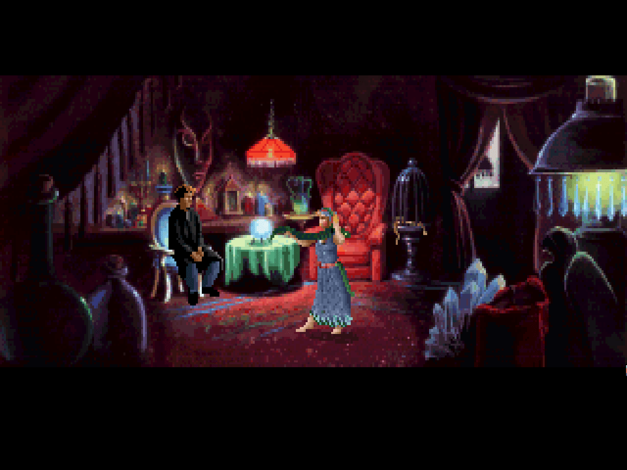
Compare this to the very similar scene from Gabriel Knight at we can see a much more highly contrasted set of elements. The black fringes of the image really make the brighter centre stand out to us, the green table really pops against the red background, and having the exit brighter through those curtains makes it immediately more apparent. Even when zoomed out quite a way, or viewed through blurred eyes, the contrasting elements of this scene draw our focus to specific, important areas - most notably that green table.
Using hue contrast is a great way to draw the eye like this. This scene from Discworld is a great example - Rincewind and the dragon are immediately eye-catching, with their bright red colours against the yellow, blue and green scene. Even from a distance, those bright reds catch our eye, and tell us what to pay attention to. The rest of the scene seems to blend into each other much more, reduced to merely nice background detail.
In addition to hue, brightness is a great way to make something stand out to us. The light cast from this doorway in Full Throttle is not only different in hue to the surrounds, but also much brighter. Again, when viewed from a distance, or through blurred eyes, our eyes focus very clearly on this element, and it's very clear that this is something that we need to pay attention to.
Similarly, Full Throttle uses difference in saturation to highlight elements to us. Here we have a very brightly coloured merchandise stand that really pops against the grey background. The presnce of colours in a sea of grey will really catch our attention, even if the values are quite similar. This is the primary ability of contrast - no matter how it's achieved, making certain elements different in specific, planned ways to their surroundings will make them stand out.
A great example of this is this corridor, also from Full Throttle, where instead of being more saturated, the important areas are less saturated. Notice there are three doors - two grey doors and one purple door. Against the purpl wall the grey doors stand right out - they break the continuity, and this catches our eye very quickly. The purple door, on the other hand, barely stands out, and is much less noticeable against the also purple wall. Naturally, the two grey doors are vital for the player to use in the game, and the purple door is of no real consequence. It doesn't matter that grey is a "duller" colour - the fact that it's different is what makes it eye catching, not the colour itself.
Another important piece of contrast is the ability to make important things a different size to those around them. This scene from The Secret of Monkey Island has an array of idols - one extremely large, a number of very similarly sized ones, and one very small. The two important elements in this scene are the very large one, and the very small one. The rest are merely background details. In making the two important elements different from the others - whether bigger or smaller - they stand out to us, and give subtle (and no so subtle) hints on where our attentions should be focused.
Yet another aspect to consider is the ability to make elements differ in shape. This scene from Indiana Jones and the Fate of Atlantis shows a great use of repetition to make certain elements uninteresting - many repeated pots and cloths that suggest that these are less important to us. Near the centre of the scene, however, is an important mask that we can collect, and it's very different shape makes it stand out from the surroundings - the sharp points standing out nicely from the rounded edges of the pots that clutter the rest of the scene. It's very similar in value, size, saturation and hue to the other elements, but its different shape makes it stand out clearly nevertheless.
Yet another element to consider is clarity, or the hardness of edges. This scene from Discworld is a great example of the depth of field effect - when viewed normally, the distant mountains are quite blurry and out of focus. This makes sense, we're looking at the more prominent foreground, and having the distance in focus would clutter up the scene a little more. When we ask Rincewind to look at those distant mountains, however...
...suddenly the depth of field changes - the foreground elements in the far left of the scene now become blurry, and those distant mountains are suddenly very clear and sharp. This makes them stand out much more, and as soon as Rincewind has finished looking at them, they go back out of focus, shifting our attention, with his, back to the foreground again.
These various forms of contrasts are powerful tools, and really help a designer show a player what they need to be looking at. Here's a great example of a scene in Broken Sword where, despite being very small, important items stand out very clearly to the player because they stand out clearly from the foreground. Normally I'd be nervous about having items be so small in a game, but having them so bright means there's no way to miss them.
Combined, the various forms of contrast make for quite a visual force. Notice in this Broken Sword scene that the flower vendor stands out despite the rather detailed, cluttered backdrop - the different shapes, patterns, colours and sizes of her stand means she's clearly visible to us. Working in unison, they make an important part of a scene perfectly readable.
This scene from EcoQuest shows the opposite - a noisy scene that's quite hard to read. The exit in the top left corner of the scene is a particular problem here - I missed this for a long time when I played the game, because the blue of this exit is so similar to the blue of the sand that it hardly stood out to me, and there's similar levels of detail all around it. Amusingly, the brain coral is perfectly visible, because that dense, interesting texture really pops by being so different, and really becomes the eye-catching feature of the location.
Compare this to the dark cellar of this Irish pub in Broken Sword, where it's immediately evident what we need to click on. It's quite common for players to joke about elements that are so instantly visible, as here, but as designers we usually favour something being more visible than it should be than something being not visible enough. The needs of the players, after all, come first.
There are, of course, exceptions to this rule. This screenshot from Waxworks shows this very well, with a thin, faint trip line running across the path, ready to trap any adventurers that aren't paying careful attention to where they step. Even when looking directly at the cursor, it's very hard to make out the wire, making this a perfect trap to trick players in a game full of nasty tricks.
Contrast, then, is an essential factor to keep in mind, and is one of the simplest things to learn. The power of juxtaposition is applicable everywhere, and is the best way to show players what they need to be paying attention to. Whether highlighting a character, showing the path they need to walk down, or indicating some clue that they can pick up, the use of contrast will suit a wide range of situations, and will help you guide your players along their way.
Sunday, March 12, 2017
Screenshot sources for adventure games
MobyGames - a long running site with thousands of games, with excellent amounts of detail about releases, and often will have screenshots from differing versions of a game. The most comprehensive game information archive that I know of.
Imgur - Neurotech - Galleries of LucasArts adventure game backgrounds, minus characters. Great if you want to see the background art without characters in the way - though be aware that the GIF format means some of the colours are slightly different. Also has scenery from Infinity Engine games, if that's your kind of thing.
Sierra Wallpaper - An excellent resource for Sierra developed and published games, with dozens of screenshots per game, showcasing hundreds of scenes. The site allows you to select a resolution to download the images at, making it an excellent resource if you want to use these old games to spruce up your desktop.
Adventure Rooms - Screenshots of many adventure games, resized to correct aspect ratio, with nearest neighbor up-sizing. A great range of games that doesn't focus on any particular publisher, and especially handy to show the older games at the proportions they were designed to be seen.
Adventure Games Backgrounds - Many screenshots from adventure games, including some less known ones, and Sierra games without characters in some examples. The images aren't pixel perfect due to the manner in which they were captured and saved, though, so keep this in mind.
If you're looking to browse through some adventure game art, these are excellent resources. I really appreciate being able to turn to these archives to find a specific shot, it minimizes the need to play through each game to find the scene I want to capture. Feel free to let me know of any others I've missed in the comments section.
Saturday, March 11, 2017
Full Throttle Scenery Studies
Over the past couple of months I've been regularly going through the background art of Full Throttle and making notes about it, trying to figure out what makes the scenes work so well. Those of you who follow me on Twitter have no doubt seen them appearing on my timeline regularly, and may be interesting in seeing the images in better quality than Twitter's image compression allows, and those of you who don't might be interested in seeing what I've been studying.
In any case, you can download all 29 of them compiled as a single PDF by clicking this link:
Full Throttle Scenery Analysis (41MB)
Enjoy!
Windows as a visual tool
Having looked at reflective windows last week, it's a fine time to look at windows that let light pass through, too. One of the most interesting design tools, windows can provide interesting shapes, introduce new colours, act as a source of light, and show us the world waiting to be explored, beckoning us to adventure and saying 'Where do you want to go today?' As the above scene from Beneath a Steel Sky shows, they're a great way to add a whole new layer of visual interest to any location, and their benefits and uses are many.
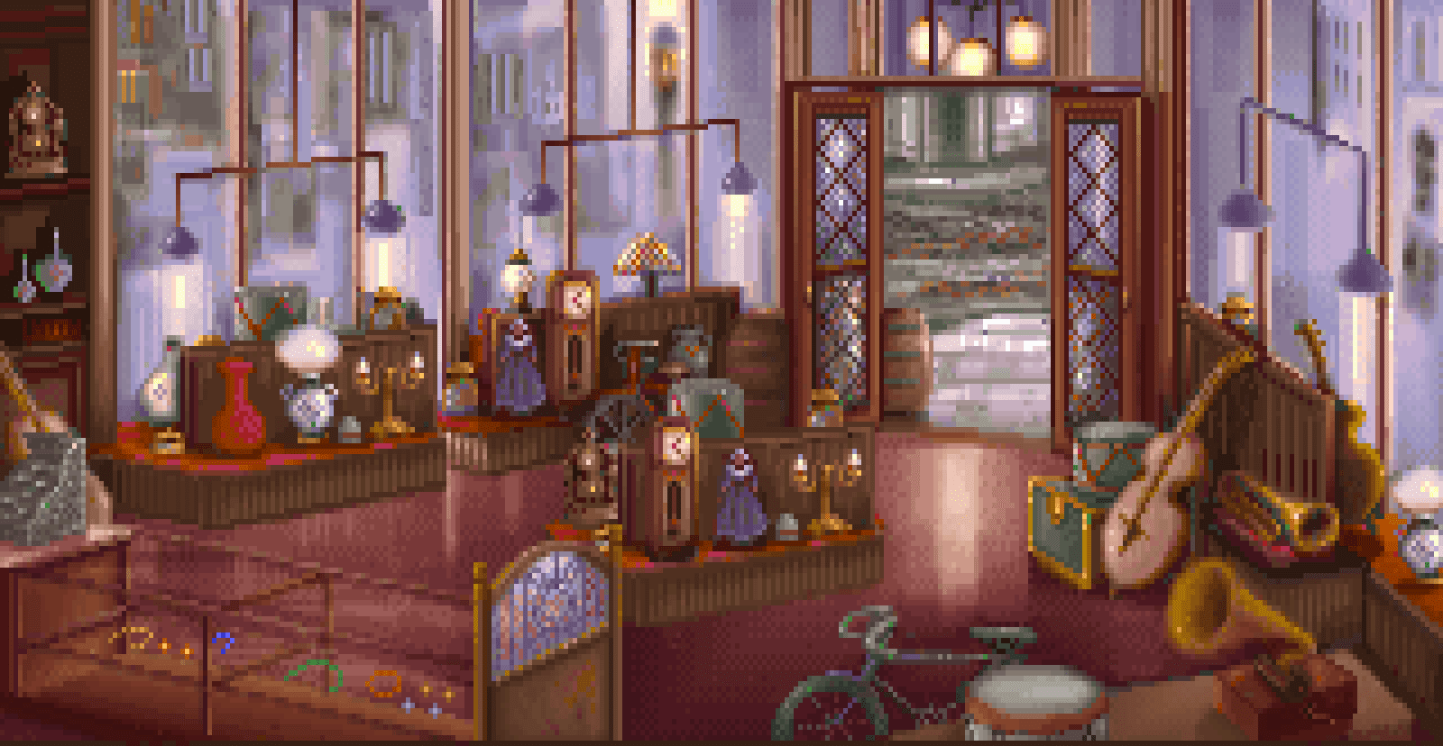
This scene from The Lost Files of Sherlock Holmes shows a similar idea, with the large expanse of windows breaking down the barrier between the store's interior and the street outside, letting in light and a feeling of life outside. Particularly nice is how these windows, unlike the previous ones, affect the colour of the world outside, allowing us to see the glass's presence, and making a clear divide between the visual layers. This also helps us see more clearly where the doorway is, which is always an essential consideration.
A more extreme version of a similar layout, this example from Space Quest 5 shows, once again, walls being replaced with windows, showing the outside world wonderfully, and providing excellent amounts of light. It makes for a very open, panoramic scene, and it's still very easy to distinguish the boundary between interior and exterior because of the window frames. These are a great way to provide structure and perspective to windows.
Important, too, to remember that windows aren't necessarily just used to show the outside world. Another shot from Space Quest 5 here, this time with windows acting more as a partition between two man made areas. Livening up corridors in this way is a great method for adding depth and life to what can be quite dull areas in a game, as well as being potential ways to add interesting gameplay. What's really nice here is how the shape and framing of the window really gives the impression of advanced technology, lending itself well to the science fiction nature of the game.
Taken to an even further extreme, this shot from The Dig shows ornate, complex framing that suggests an alien architect very well. The delicate structure feels at once organic and also designed, like the web of a spider, which gives an interesting insight into the mindset of the alien designers. You can also see that this window is the only light source for the scene, making it feel dark and shadowy, with the window becoming a real feature. This is also an interesting shot because the window shows an underwater scene, meaning that visibility is much more limited, and we mostly appreciate the light and colour rather than any specific landmarks.
The design of windows is great for suggesting a number of specific environments. Church windows, especially the stained glass scenes that are so iconic of them, are instantly evocative of quiet religious locations. The massive lancet windows in this scene from Broken Sword also flood the scene with white light, which is evocative of holiness, and even their shape feels indicative of a place of worship.
A great example of this is Bishop Mandible's cathedral in Loom. The rose window here instantly provides an impression of a holy place, which is reinforced by the flying buttresses on either side. The juxtaposition formed between these and the sinister spikes and arcane glow makes this a particularly memorable scene, and is a good example of showing how windows aren't merely a source of light for daylight coming in, but also can be used as a source of light when the lit interior of a building is seen from the outside at night.
Though many of these church windows are massive, it's the design, not the size, that conveys the idea. This small chapel from Conquests of the Longbow features much milder, simpler arch windows that nevertheless look perfectly at home here. A nice touch here is the suggestion of a crucifix within the shape, helping to reinforce this idea further.
Another great use of shape is this portal from Quest for Glory. Though it could be seen to be as much doorway as window, its fascinating shape feels emblematic of the arcane, and is noticeably different from the rest of the architecture in Spielburg, really giving it that otherworldly feeling. This is further enhanced by the fact that the simple location looks out onto what is, apparently, a cloudy skyscape, as though we're looking in on a totally different world. A really nice way to elevate a magician's building into something much more fantastical.
Windows don't need to show us interesting things to be worthwhile, either. The windows in this Broken Sword scene are little more than a source of light, but in filling this function, they also add a great sense of architecture and design to the scene. The arches and curves of these windows really elevates the location to something dynamic and decorative, without the stained glass of a church or any details of the outside world.
This shot from Gabriel Knight is a great example of windows who don't exist to be seen through - instead, here they're merely a light source, but one that becomes a real focal element of the scene, with the strong light shining through suggesting that it's a very strong source of light. Their presence in the scene is very strongly felt, despite the actual windows themselves being very small.
In fact, we don't even need to show the windows in a scene to suggest their presence. This location in Day of the Tentacle is very clearly lit by a window - we can see the light it casts on the floor - and the window's presence is very strongly felt, without the need to actually put it in the scene. This is often referred to as a "hidden light source" - where we can feel the effects of a light source on a scene, and get a decent idea of where it's coming from, without actually showing the source of light itself.
They can also make a great way to frame a scene. This window from Leisure Suit Larry isn't the focus of the scene, but a way to direct the focus. It makes for a great way to decorate the unneeded areas of the area, while also feeling slightly voyeuristic. A really creative, believable way to use up the empty space on the edges of a shot, and an interesting way of putting scenery between the player character and the player, without getting in the way of gameplay.
This scene in Universe takes the idea to an even greater extreme, where we're looking through windows at a scene, despite being pulled back from it. This is one of the beauties of windows - even when they're forming a barrier between the characters and us, they still let us interact with the game, and so can be a very useful consideration when trying to add layers of depth to an otherwise very flat scene like this. Once again, the interesting shapes here really gives the impression of a futuristic setting very well.
Finally, even when the presence of windows wouldn't make sense, an artist can break holes in walls and ceilings for their own benefit. This decommissioned ship from Monkey Island 2 is a great example of the lack of windows being worked around by simply adding huge, gaping holes in the ceiling, serving the exact same purpose that a window would, without the need to justify someone installing a window in such an unusual location. Notice how the beams catch light from both the interior and exterior here, a wonderful use of light sources both outside and inside to create a very evocative piece of scenery.
Windows are a fantastic way of playing with a scene - whether it's adding depth, adding light, bringing colour, breaking up a dull wall with an interesting shape, or as interesting framing for players to view the world through. Their uses are incredibly versatile and varied, and well worth exploring in greater detail for anybody interested in adding another layer of beauty to their locations.
Subscribe to:
Posts (Atom)